Same ‘Spring,’ Different Colors — The 4 Attributes That Define Your Personal Color
Ever gotten a personal color diagnosis but still couldn’t quite figure things out, noticed you and a friend were both diagnosed “Spring” yet look good in totally different colors, or even gotten a different season each time you were tested and wondered, “Was one of these a misdiagnosis?”
It’s not a misdiagnosis. Personal color isn’t decided by season alone. A season is like the “name of a neighborhood” — what actually determines your true colors is four attributes within that neighborhood. By the end of this article you’ll be able to ① estimate your own attributes, ② know your tone’s best colors, and ③ know what to do when things still feel confusing.
1. Why It’s Confusing — A Season Is a Neighborhood Name, Not a Street Address
Even within the same “Spring,” people suit different colors because value, chroma, warm/cool, and clarity vary from person to person within a season. On top of that, different color systems (APL uses the KS 14-season system) and naming conventions vary by provider, adding to the confusion.
💬 “Light” in “Spring Light” just describes the neighborhood’s vibe — “a bright warm tone” — it doesn’t mean “only wear light colors.” Your best colors depend not on the neighborhood (season) but on the exact address (attributes).
2. The 4 Attributes That Determine Your Color + Self-Check
Each attribute comes with an “if this, then you’re this” self-check. Grab a mirror and check for yourself.
🔆 ① Value · How Bright

- ✅ Bright pastels look radiant on you, but dark colors look dull → high value
- ✅ Dark colors actually look more elegant on you, while bright pastels make your face look washed out → low value
🎨 ② Chroma · How Saturated (soft pastel ↔ vivid)

- ✅ Crisp, vivid colors make your face pop → high chroma
- ✅ Muted colors look more elegant on you, and vivid colors just draw attention to “the color, not your face” → low chroma
🌡️ ③ Warm · Cool — Warm or Cool
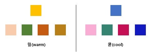
- ✅ Warm colors with a yellow undertone suit you well → warm
- ✅ Cool colors with a blue undertone suit you well → cool
(Jewelry has plenty of exceptions, so use it only as a secondary reference — if gold suits you, that leans warm; if silver suits you, that leans cool, as a general tendency. Exceptions do happen too, like when your body tone and face tone differ.)
💧 ④ Clarity · Clear or Soft
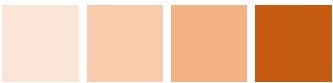
- ✅ Grayish, muted colors like beige or khaki don’t suit you, while clear, clean colors suit you well → clear
- ✅ Soft, hazy colors suit you comfortably → soft
3. The Key — Your “Top-Priority Attribute” Determines Your Tone
You have all four attributes, but the one that matters most varies by person. That top-priority attribute defines the range of colors you can wear. (This is why some people find both warm and cool colors suit them — it turns out that for them, only “brightness” matters, and temperature is flexible.)
How your top-priority attribute plays out:
- Value is top priority → as long as it’s bright, warm or cool both work → Spring Light · Summer Light
- Chroma is top priority (high chroma) → vivid colors suit you → Clear · Strong
- Chroma is top priority (low chroma) → muted colors look elegant → Muted
- Warm/cool is top priority (warm) → warm colors → Spring · Autumn Warm
- Warm/cool is top priority (cool) → cool colors → Summer · Winter Cool
4. Your Tone’s Best Colors — The 14 Seasons in One Line Each
Now for the practical part. Here’s your tone’s (or candidate tone’s) best colors, summed up in one line. Knowing just this before you shop cuts down on mistakes.
| Season | Best colors by tone |
|---|---|
| 🌸 Spring | Light: clear pastels · Soft: gentle, soy-milk-like soft pastels (muted tones OK) · Bright: vivid mid-chroma · Clear: vivid high-chroma |
| 🌿 Summer | Light: clear pastels · Bright: mid-chroma (avoid extreme high chroma) · Muted: calm, muted tones |
| 🍂 Autumn | Muted: muted tones · Strong: deep, saturated primaries · Deep: dark, low-value colors (dark tones with black mixed in fall under Autumn Deep) |
| ❄️ Winter | Clear: clean and vivid · Strong: deep, saturated primaries · Deep: rich dark colors · Soft: calm, bright muted tones (contrast matters, restrained cool tones) |
5. “This Feels Like a Misdiagnosis” — When Confused, Use Overlapping Tones Together
Diagnoses may not match 100%, but tones that share the same worst colors (colors to avoid) are grouped together. If you’re still stuck after searching, referencing these groups will widen what you can work with.
🔗 Overlapping tone groups:
- Spring Light ↔ Spring Soft ↔ Autumn Muted — the dividing line is whether muted tones are used. If strong-white pastels make you look washed out, you lean Soft/Muted.
- Summer Light ↔ Summer Muted — both are “Summer,” but split on clear pastels (Light) vs. calm muted tones (Muted).
- Summer Bright ↔ Winter Clear — these two are frequently confused (splitting on mid-chroma vs. clarity).
- If brightness is top priority, Spring Light ↔ Summer Light are compatible; if darkness is top priority, Autumn Deep ↔ Winter Deep are compatible.
👉 If you suspect a misdiagnosis, try wearing colors from the overlapping season too — the best tones have a similar texture, so you’ll have much more to work with.
6. The Most Commonly Confused Pair — Bright vs. Clear
Bright = radiant, lively ☀️ → mid-chroma pastels are your best bet. Too much white or extreme high chroma won’t suit you.
Clear = clean, vivid 💎 → low-chroma and high-chroma both work best. Ambiguous pastels will make you look puffy — plain white is often better.
👉 The single dividing line is whether mid-chroma colors suit you.
7. Checking the Numbers — APL’s Actual Diagnosis Distribution
This all sounds abstract until you look at the numbers. When we tally APL’s actual diagnosis cases by tone, the theory above plays out exactly as described.
| Season | Cases by tone | Total |
|---|---|---|
| Spring | Spring Light 128 · Spring Clear 54 · Spring Warm 46 · Spring Bright 11 · Spring Soft 10 | 249 |
| Summer | Summer Light 100 · Summer Cool 56 · Summer Muted 46 · Summer Bright 4 | 206 |
| Autumn | Autumn Muted 111 · Autumn Warm 51 · Autumn Deep 38 | 201 |
| Winter | Winter Cool 43 · Winter Deep 42 · Winter Clear 28 · Winter Strong 16 · Winter Soft 8 | 137 |
📸 The most common tones are Spring Light, Autumn Muted, and Summer Light — matching exactly the “value/chroma top-priority types” from the flow in section 3. The theory shows up directly in real diagnoses. (Based on Instagram hashtags, so a single post can count toward multiple tones.)
👀 See real cases: Spring Light · Autumn Muted · Winter Deep · Summer Cool
Takeaways
- Season is the neighborhood name; the four attributes (value, chroma, warm/cool, clarity) are the exact address.
- Use the self-checks to estimate your top-priority attribute, then check the table in section 4 for your tone’s best colors.
- When in doubt, try tones that share your worst colors together.
This is as far as you can get from searching alone. Borderline attributes — gold vs. silver, whether mid-chroma suits you — ultimately require in-person draping to pin down accurately. If you’ve been diagnosed multiple times and are still unsure, we recommend APL COLOR’s in-depth diagnosis. 🙌
Sources: the four attributes and self-checks, season naming, best colors by tone, overlapping tone groups, and the Bright/Clear comparison are drawn from APL’s own materials; the Instagram diagnosis case counts are from APL’s records. Illustrations are APL blog’s original explanatory images; all other text was written in-house.
APL COLOR offers personal color diagnosis combining LS170 spectrophotometer LAB measurement with expert draping analysis. Explore our professional courses →