The Complete Guide to Personal Color 14-Season Names — Why Every Studio Calls Them Something Different (KS vs. PCCS Systems)
This article is a secondary report built on APL COLOR’s official blog source material. The description of Summer Light reflects a consultant correction (Summer Light = clear pastels) applied to the original wording.
Ever gotten diagnosed as “Spring Warm Bright,” then searched online only to find names like “Spring Clear,” “Spring Vivid,” “Spring Pale” — some studios use them, some don’t — and wondered, “Wait, was I misdiagnosed?”
The short answer: in most cases, it’s not a misdiagnosis — it just needs translating. Similar season names ultimately describe similar underlying attributes. By the end of this article, you’ll be able to translate any name you’ve heard from another studio into APL’s 14-season system yourself.
1. Why Do Season Names Differ Between Studios?
The biggest reason personal color season names differ from studio to studio is that they’re diagnosed using different color systems. Personal color diagnosis is usually based on one of two systems: the KS color system or the PCCS color system. APL COLOR uses the KS color system as the basis for its 14 season names. Depending on which color system a studio uses, both the names and the tone boundaries can shift slightly.
Think of it like map apps drawing slightly different boundaries for the same neighborhood. Your face (the neighborhood) hasn’t changed — it’s just that the map (the color system) is different, so the names and borders look different.
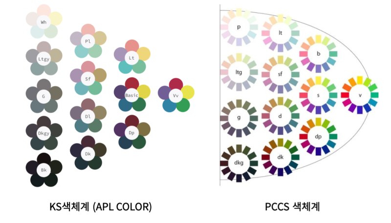
2. APL’s 14 Seasons at a Glance
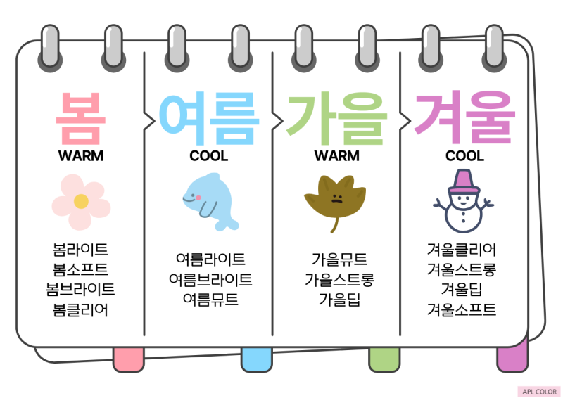
APL COLOR’s 14 seasons break down like this:
| Season | Warm/Cool | Sub-tones | Count |
|---|---|---|---|
| Spring | WARM | Spring Light · Spring Soft · Spring Bright · Spring Clear | 4 |
| Summer | COOL | Summer Light · Summer Bright · Summer Mute | 3 |
| Autumn | WARM | Autumn Mute · Autumn Strong · Autumn Deep | 3 |
| Winter | COOL | Winter Clear · Winter Strong · Winter Deep · Winter Soft | 4 |
3. How to Read the Modifiers — “Light” Doesn’t Mean Light Colors Are Your Best Match
The modifier in a season name (Light, Bright, Mute, etc.) describes the overall character (image) of that season, not a literal rule. Spring Light doesn’t mean light-colored shades are automatically your best match — it means “bright warm tones suit you best.” Which colors actually suit you best has to be worked out carefully during diagnosis, factoring in value, chroma, warm/cool, clarity, hue, and contrast together.
So each tone has its own “texture” of best colors. Here’s a quick reference:
| APL Tone | Best Color Texture |
|---|---|
| Spring Light | Clear pastels |
| Spring Soft | Soft, soy-milk-like pastels (muted tones also work) |
| Spring Bright | Mid-chroma, between Spring Light (low chroma) and Spring Clear (high chroma) |
| Spring Clear | High-chroma, vivid warm colors |
| Summer Light | Clear pastels (cool). Muted, calm colors belong to Summer Mute |
| Summer Bright | Mid-level chroma (extreme high chroma can overwhelm) |
| Summer Mute | Muted, calm cool colors |
| Autumn Mute | Muted tones are BEST |
| Autumn Strong | Clear (saturated, deep) colors are BEST |
| Autumn Deep | Low value (dark) colors are BEST |
| Winter Clear | Very clear or very sharp “clarity” colors are BEST |
| Winter Strong | Deep, saturated colors are BEST |
| Winter Deep | Deep, dark colors are BEST |
| Winter Soft | Calm, bright muted tones + contrast (a restrained cool-winter tone) |
4. Translation Table — Other Studios’ Names → APL’s 14 Seasons
If you were diagnosed under one of these names elsewhere, there’s a good chance it overlaps with the following APL 14-season tone.
| Other Studio’s Diagnosis | APL Diagnosis |
|---|---|
| Spring Pale · Spring Whitish | Spring Light |
| Autumn Light | Overlaps with Spring Soft |
| Autumn Soft · Dark Spring Soft | Autumn Mute |
| Spring Vivid | Spring Clear |
| Summer Pale · Summer Whitish | Summer Light |
| Summer Soft | Summer Mute |
| Summer True · Summer Clear | Mid-chroma cool zone (texture of Summer Bright) |
| Winter Bright | Zone where Summer Bright and Winter Clear overlap |
| Autumn True · Spring Strong | Autumn Strong |
| Autumn Dark | Autumn Deep (a concept contained within Autumn Deep) |
| Winter Pale · Winter Light · Winter Vivid | Winter Clear |
| Winter Dark | Between Winter Deep and Winter Soft (leans Winter Soft if muted tones suit you) |
| “Bright Summer Mute + contrast” | Winter Soft |
This doesn’t mean the listed names are 100% identical. But overlapping seasons are highly likely to share the same worst colors, and their best-color textures tend to be similar. So treat this table not as an “answer key,” but as a map that widens the range of colors you can safely try.
For example, here’s how the Spring-side tones relate to each other. (Clarity = whether a color reads as clear or muted)
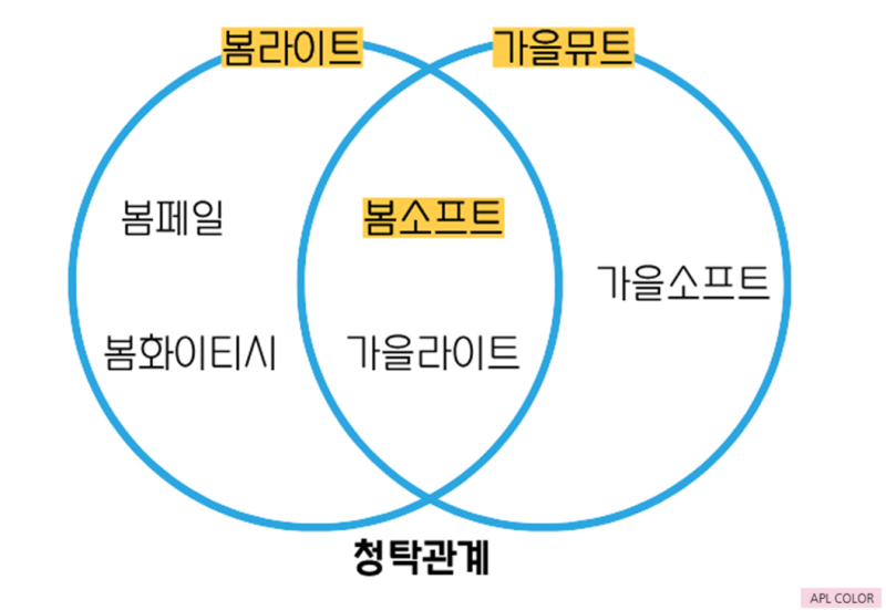
5. The 3 Most Common Points of Confusion (Starting with Spring Light vs. Spring Soft)
Spring Light vs. Spring Soft
The difference comes down to whether muted tones work for you. Muted doesn’t mean dull or drab — a pastel that’s too purely white can look puffy or washed out, while a soft, soy-milk-like pastel that suits you well points to Spring Soft.
✅ Self-check: Do bright pastels still make your face look washed out or floaty? → Try Spring Soft (soft pastels) first.
Summer Bright vs. Winter Clear
Summer Bright’s best colors sit at mid-chroma — extreme high chroma can overwhelm. Winter Clear depends on a very clear or very sharp “clarity” quality.
✅ Self-check: Do bold primary colors make the color look like it’s floating off your face? → Summer Bright’s mid-chroma range may suit you better than Winter.
Winter Soft — “A Restrained Cool-Winter Tone”
Winter tones generally suit extreme colors — go big or go home. But Winter Soft looks artificial when pushed too extreme, and feels drained when styled with Summer tones. It’s a type that can wear calm, bright muted tones rather than sharp high-chroma colors, and contrast matters a lot. That said, too much muted grey can tip it into looking dull.
6. What to Do When You Think “Was I Misdiagnosed?”
If you got a season diagnosis, searched around, and still felt confused enough to wonder “was this a misdiagnosis?” — before booking a re-diagnosis, try checking the overlapping seasons first. Overlapping seasons are highly likely to share the same worst colors, so avoiding just the worst colors already widens the range of colors you can work with.
Consultants may phrase things slightly differently, but they’re often saying the same thing in different words. For a practical breakdown of how to tell confusing tones apart, continue with What’s the Most Common Personal Color Tone in Korea? — A Practical Guide to Telling Confusing 14-Season Tones Apart.
Takeaways
- If a name looks unfamiliar, don’t jump to “misdiagnosis” — first check which color system (KS/PCCS) that studio uses.
- A modifier describes the season’s overall character — it doesn’t mean that specific color is your best match.
- If you’re confused, find the overlapping season in the translation table and start by avoiding the worst colors.
If your best colors still feel unclear, an in-depth APL COLOR diagnosis — which examines value, chroma, and clarity in detail — can pin it down precisely. Clients coming in for a re-diagnosis are always welcome.
Sources (APL COLOR official blog): A Complete Guide to Personal Color Season Names That Confuse People Because Every Studio Is Different (2025-01-20) · Was My Personal Color Diagnosis Wrong?! What to Check Before Getting Re-Diagnosed (2025-09-04). The translation table was reorganized into a table format from APL’s own diagram (clarity/chroma/value relationships) in the 2025-09-04 post, and the Summer Light description follows a consultant correction (Summer Light = clear pastels).
APL COLOR offers personal color diagnosis combining LS170 spectrophotometer LAB measurement with expert draping analysis. Explore our professional courses →